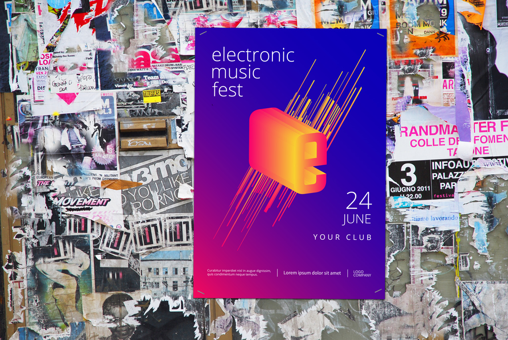
Readability is important when you want to reach people with words on flyers, posters, or billboards. Here is a guide for things to remember when scaling your designs from small to large formats.
Cover image mock-up via Who is Danny
In this guide, we take a look at how size and space affect large-scale design, like 11 x 17 in. posters up to billboards, and some things to think about during the design process. Typography elements, like Point size, tracking (character spacing), and leading (line spacing) are especially important to remember, as they depend upon their layout size and display environment.
1. Consider Message Hierarchy
Start by making sure that you have structured your messaging for impact by ordering the information.
On an event flyer, for example, set the event name at the top, in the largest type. Let’s call that Tier 1messaging. Support Tier 1 with Tier 2 messaging, e.g. the date and place of the event, in a smaller or lighter font, or placed in less dominant space.
This helps viewers know the What immediately, then they can find out the When and the Where upon closer inspection.
Tier 3 is comprised of any remaining information, such as contact info and website URLs.

Poster image by Denys Koltovskyi
2. Consider Viewing Distance
Design with the assumption that there will be distance between your poster and the viewing audience. If the event title allows, Tier 1 messaging should be readable from approximately across a large room, or about 15 feet away (with good eyesight).
Imagine your poster, or better yet, print it out and test the letter size from a distance. Can you clearly read the headline? Can anyone else?
Tier 2 messaging, such as dates and venue, are also important. Don’t make it nano-sized. If someone misses a show because they didn’t have their monocle in the breast pocket of their frock coat, that’s on you, but it doesn’t have to be viewable from as far away.

Poster elements by Denys Koltovskyi
3. Create a Buffer
Make a larger border between the trim and the live area of your poster or flyer. This sets space and distance between your message and whatever is around it. In a visually noisy environment, like a decades-old bulletin board, this is especially important.
4. Use White Space
Just as you would create a buffer between your canvas and its external surroundings, use the space within your design so your message becomes larger and louder by boosting the inner dynamics with visual weight.
5. Use Contrast
As with using white space, use contrast in color or typefaces to increase hierarchical difference. For instance, a large but lightweight serif font pairs well with a bold yet smaller sans-serif font.
Though they differ in size, they appear to be of the same importance due to visual weight. That creates contrast through interesting juxtaposition, while maintaining equality in the hierarchy.

Background image by claudio zaccherini
Tips for Readable Flyers and Posters
Flyers (usually 8.5 x 11″ and smaller) and posters (usually over 8.5 x 11″) are often displayed among other visual noise that viewers pass by and ignore every day. However, when designed properly for this context, these mediums can stop a viewer in their tracks, cutting through the noise to get the message out.
You either want the message to cut through the general clutter of the world with focus and clarity, or you want the design to draw attention, creating curiosity. With either approach, legibility is key. In a nutshell, if you can’t read a flyer or poster, it’s pointless. The coolest looking and most conceptual concert posters don’t do their job if no one can read what they say.
In fine art, or design for design’s sake, you can obscure your message to the brink of oblivion. In most cases, though, you are designing a poster to advertise the art show itself.
Billboard mockup by Who is Danny
Tips for Billboard Design
The difference in environments of larger-scale work dictates that we try to solve for uncontrollable factors, such as visual noise and a viewer’s movement. We always want to strive for readability, so it’s important to mock up your work to anticipate the differences. Here is a good comparison guide to use for type size and distance.
The messaging is usually kept brief, perhaps the company name/logo, a sale announcement or slogan, and a telephone or website URL. Making mock-ups, in which the art is scaled to a photo of the environment, can help you understand how readable your artwork looks in a specific space.
Make a mockup of a billboard with your artwork, evaluate it, and adjust accordingly. Find some mock-ups here.

image via ImageFlow
Messages and wording can easily get lost if you fail to consider the environment and behavior of the viewer. Always think about the end product and its placement: how it sits in a place, what that place is, and how your message can interact with or stand out from that place.
You’ll know your design is successful when you can tell friends and family what you’ve been up to and they say, “Oh I drive by that every day! I hate you now.” Your message was noticed!
Want more design tips, tutorials, and insights from experts? Check out more of our content:
